




JUANITA
Film poster design. 2025.
Scope: Movie Title Design, Poster Design, Art Direction, Typography, Print, Press Kit.
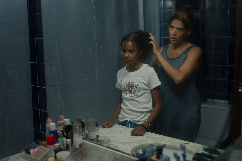
JUANITA is a short film written and directed by Karen Joaquín and Uliane Tatit that dives into the internal struggle of a 12-year-old Latina girl, dealing with beauty standards and social pressures as she transitions into adolescence. Selected for its world premiere at the 75th anniversary of the Berlinale, Juanita's story highlights the universal insecurities many girls feel while trying to balance their identity with the societal standards imposed on them.
The visual style of the project is inspired from a mix of grunge and retro, two aesthetics known for their raw and authentic tone, perfectly capturing the internal battle of a girl in the process of self-discovery, feeling, and growing all at once.
The bold, all-caps title with a worn, irregular font, paired with a vibrant red as the main color, reflects the intense emotions of the protagonist.
The imagery, on the other hand, blends moments of strength and vulnerability, showing different sides of her personality and giving a glimpse into the many sides of herself that also exist within her.
JUANITA es un cortometraje escrito y dirigido por Karen Joaquín y Uliane Tatit que explora la lucha interna de una niña latina de 12 años enfrentando las expectativas de belleza y las presiones sociales durante su transición a la adolescencia. Seleccionado para su estreno mundial en el 75° aniversario de la Berlinale, la historia de Juanita muestra esas inseguridades universales que muchas niñas sienten mientras intentan equilibrar su identidad con los estándares impuestos por la sociedad.
El estilo visual del proyecto se inspira en una mezcla de grunge y retro, dos estéticas conocidas por su tono crudo y auténtico, que capturan a la perfección la lucha interna de una niña en proceso de autodescubrimiento, sintiendo y creciendo a la vez.
El título en mayúsculas, con una tipografía desgastada e irregular, acompañada de un rojo vibrante como color principal, refleja la intensidad y fuerza de las emociones de la protagonista. Las imágenes, por su parte, combinan momentos de fuerza y vulnerabilidad, revelando las diferentes facetas de su personalidad y dando una pequeña pista de las versiones de ella misma que también están presentes en su historia.
© Whiniffer Feliz 2026.
Made with care & too many
open tabs ✦